Product Offers
Context
Razorpay capital offers credit products to its users such as Line of credit, corporate credit card & Loans. To apply for credit,
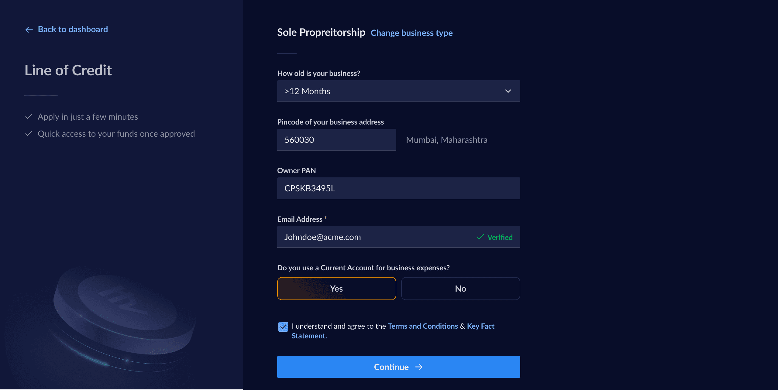
Users must first fill in an online application with their personal & business details.
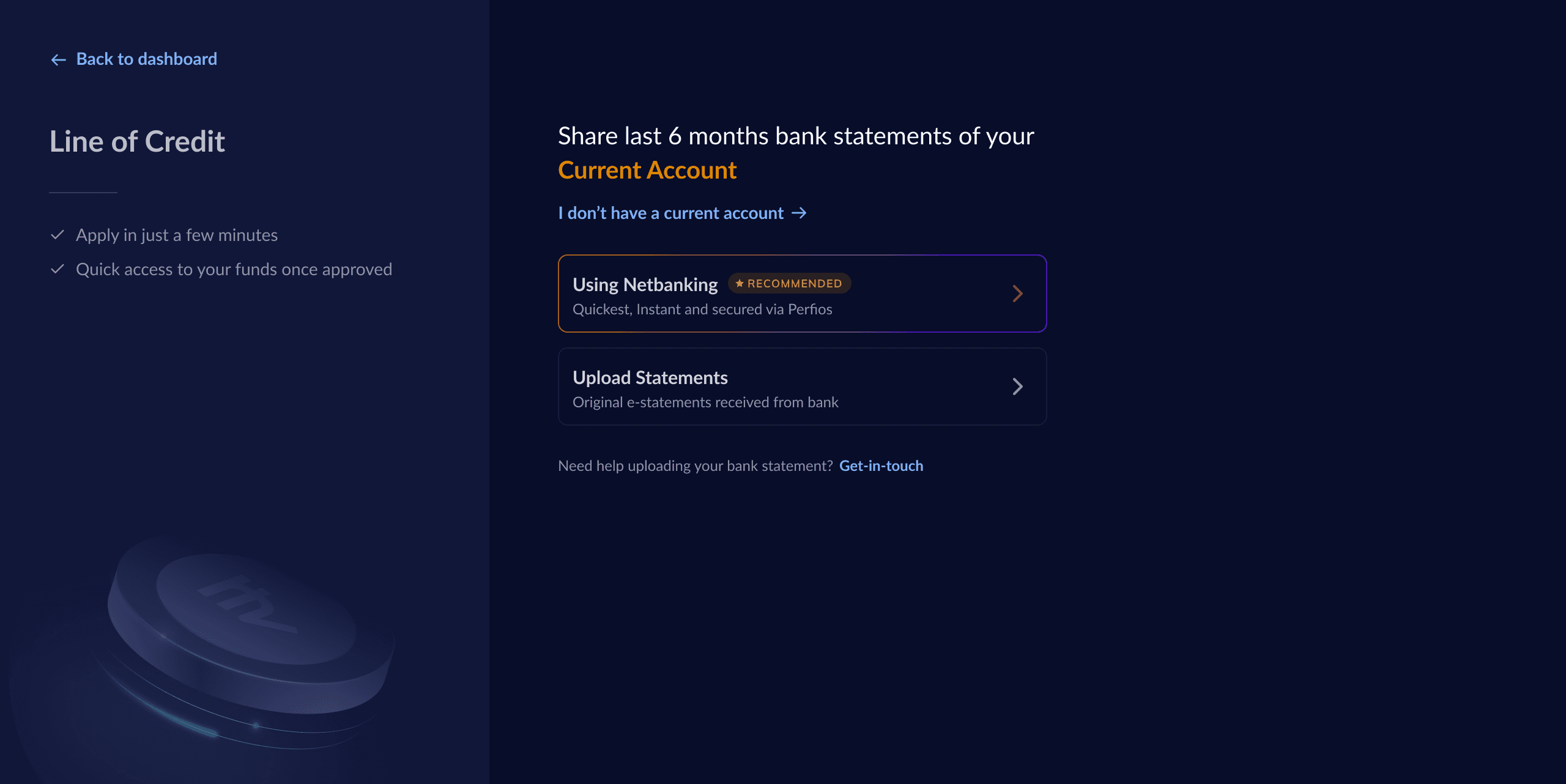
Then upload their past 6 months bank statements.
Razorpay then evaluates the application & presents an offer.
We noticed that the bank statement upload process had a significant drop-off rate of ~50%. It became crucial to understand the reasons behind this high drop-off and implement solutions to address them.
Timeline
3 Weeks
Team
1x Product designer (Me)
1x Product Manager
1x Front end engineer
1x Back end engineer
Current Journey
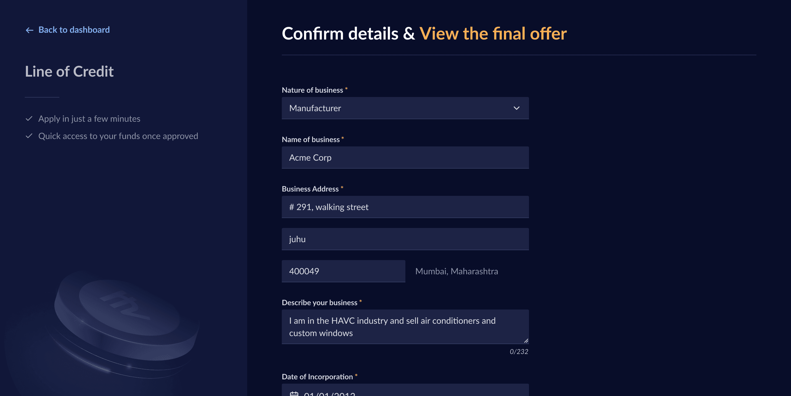
Step 1: Enter personal details
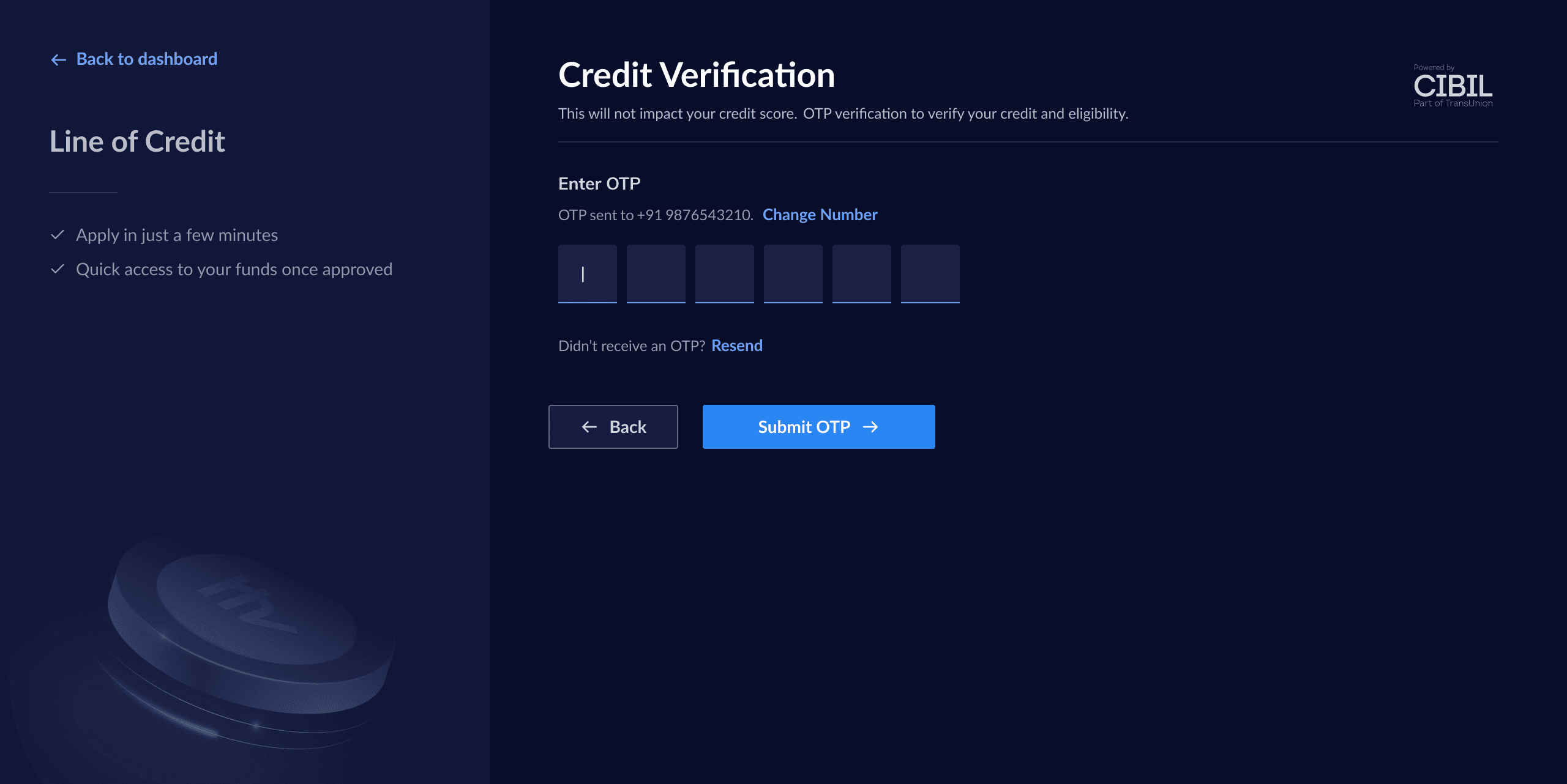
Step 2: Credit verification
Step 3: Bank statement upload
Step 4: Business details
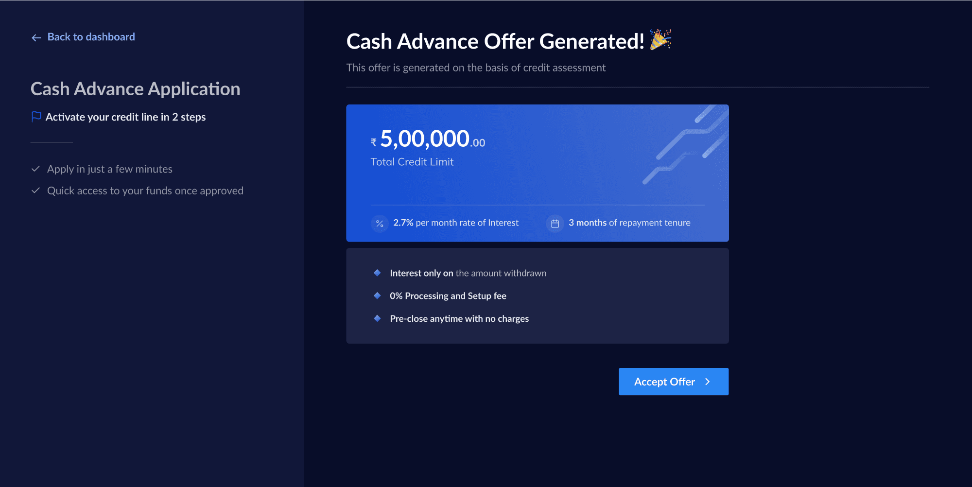
Step 5: Offer generation
Process Deep Dive
To better understand the offer journey & how the offers are perceived, I collaborated with the product, sales & underwriting stakeholders
The current avg. ticket size & the factors deciding it.
How does the sales team pitch the offer to users?
What about the product currently excites the users?
What questions/counter points do the users have?
💡Key Insight
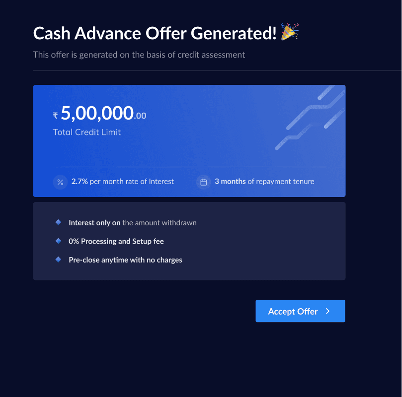
What’s lacking in the current journey?
Feels robotic & is quite basic.
Doesn’t celebrate the user’s effort, the credit limit is the only motivator.
Is mostly sales led and not truly self serve.
What does a successful redesign mean?
Offer details are upfront & easy to consume
Looks dynamic & gives a celebratory feeling
Doesn’t overwhelm or distract the user
Iterations
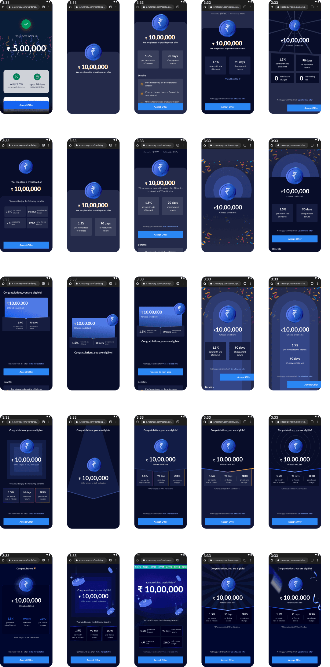
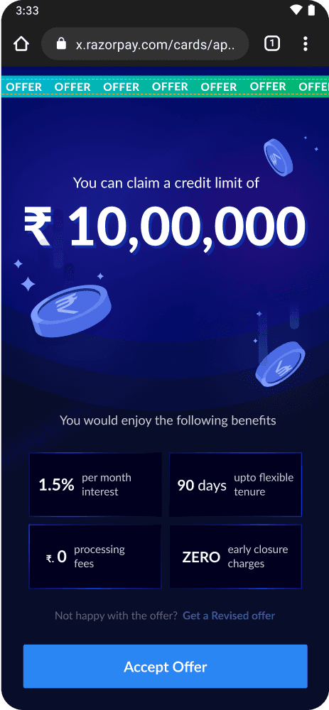
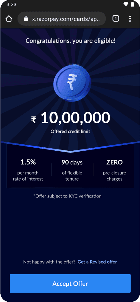
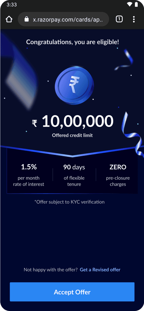
Shortlisted options
Option 1
Option 2
Option 3
Did an internal voting with team and went ahead with option 3 as it satisfied all the criteria that we had set:
Is easy to consume
Doesn’t overwhelm or distract the user
Is dynamic & gives a celebratory feeling
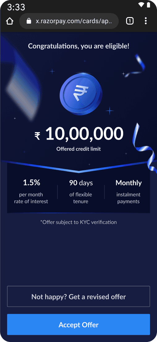
Final Design
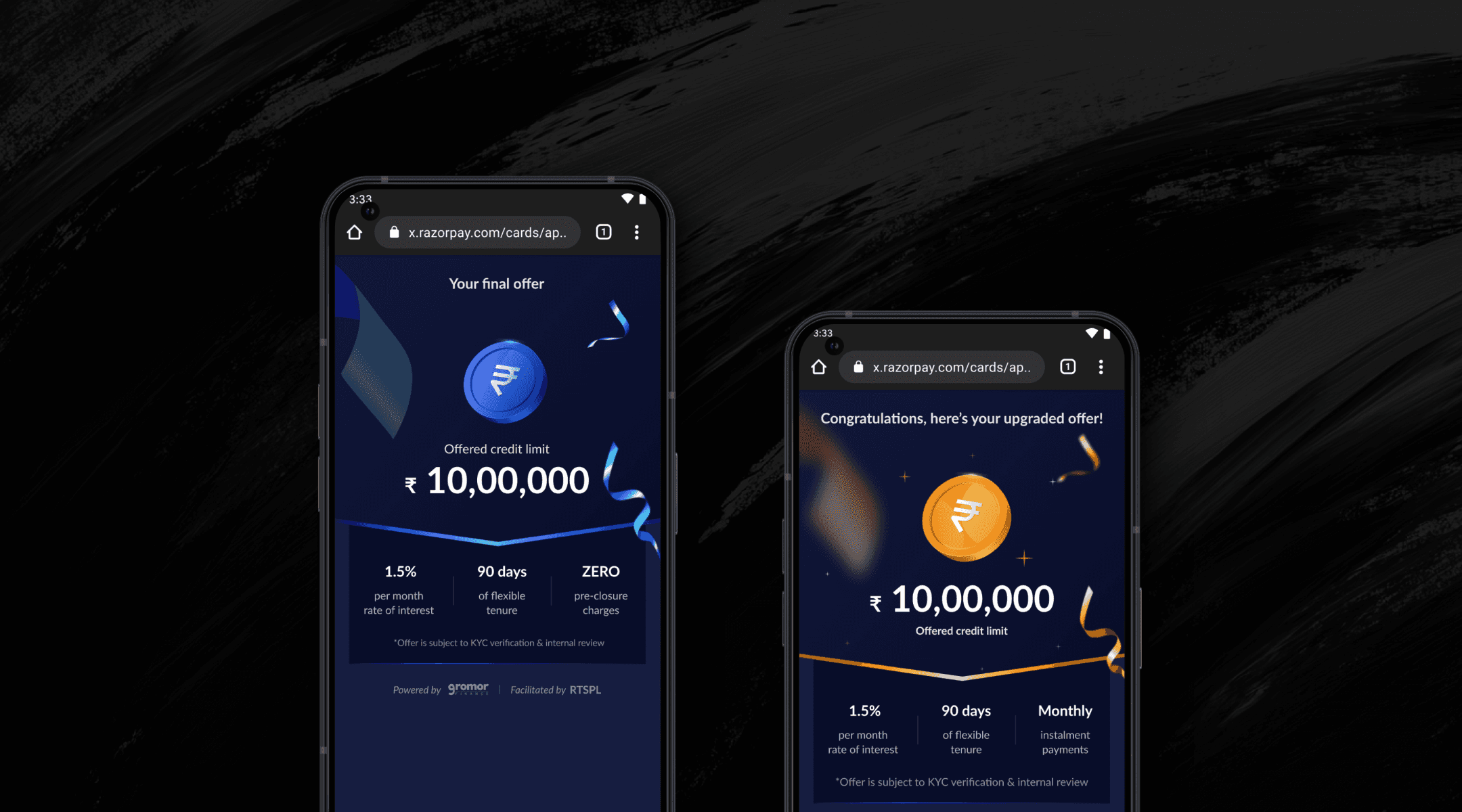
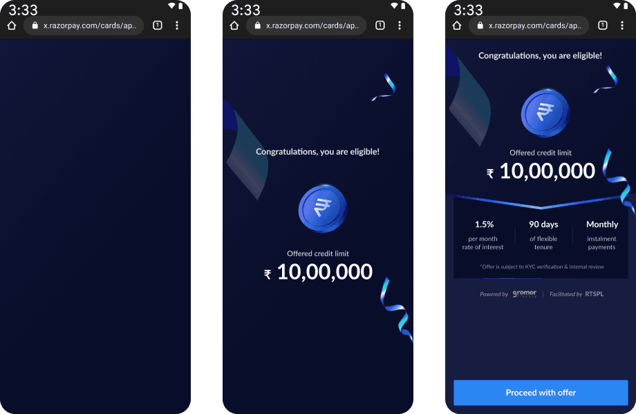
Offer: You are eligible
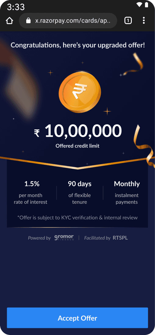
Offer: Upgraded
Motion Design
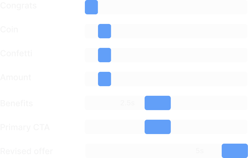
To elevate the experience further, I started planning out in what order information should be displayed to the user & How should the elements appear on screen.
Finalised approach
I worked with the communication designer & the front-end engineer to develop a more refined version of the above iteration. Through this project, I was able to effectively push the boundaries of dashboard UI design at Razorpay while adhering to the colour tokens from the design system.

